Many clients log into their Schwab accounts in order to see how their portfolios are doing.
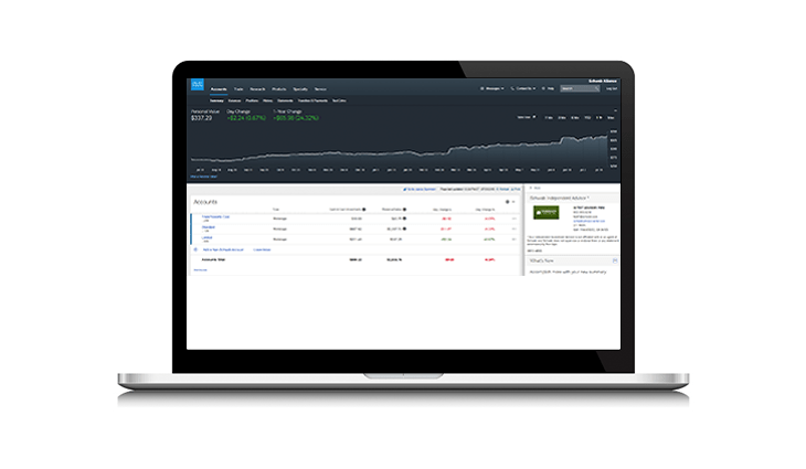
When you first log on to Schwab Alliance, you are greeted with a large dark grey banner that lists your “Personal Value” followed by either a green or red number denoting a certain time period of change.
Here is the Schwab news releases on the subject:
July 2017, “A new personal value chart featuring historical values.”

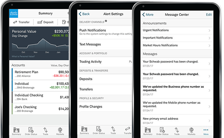
November 2017, “Version 8.0 of the Schwab Mobile app is now available to your clients. …New Account Summary view that makes it easier for clients to see important details”

August 2018, “All clients will be defaulted to the new view by the end of year”

The idea of having an easy to access overall report on the first page of your login is a great idea. The problem with Schwab’s is that, although it looks like a performance report, it is actually an account statement which is an entirely different report type.
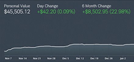
Here is an example homepage banner with a positive change:

You can see that Schwab’s home page shows the following information:
- Personal Value in Dollars
- Day Change in Dollars (and Percent)
- Time Period Change in Dollars (and Percent)
Via a separate toggle, you can change the Time Period to 1 Month, 3 Month, 6 Month, Year-to-Date (YTD), 1 Year, or Max.
The colorful green or red colors make it look like you should feel either happy or sad in response to the report, but you probably shouldn’t. The reported change percentage looks like it is measuring portfolio performance, but it is not.
The word “change” sounds like it is an ongoing process and the reported “Day Change” will often be a number which does represent that day’s market movement. The information is listed above what looks like a graph of the account value as it moves up and down with the markets. Schwab also includes what percentage the change represents.
However, despite these facts, Schwab’s presentation is not designed to report on your portfolio’s performance but rather it is intended to show a real time accounting of your portfolio’s value.
If you withdraw $100 from an account that has $2,500 in it, your bank not does not normally report that withdrawal as: -$100.00 (-4.00%). Contributions and withdrawals are personal accounting values. They are not usually seen with percentages. However, this is precisely what Schwab has done.
Imagine a negative 3-Month Change of -$118,775 or -10.71% of an over $1M portfolio. The addition of a percentage misleads the client into thinking that their portfolio performance is down -10.71% over the past 3 months when in reality they may have withdrawn $250,000 during the past three months and have an actual portfolio performance that is a positive +$131,224.96 (+11.09%).
Yes, there is a small footnote on the Schwab’s website which reads, “What is Personal Value?” When you click on the link you get another screen which consists of five lengthy disclosure paragraphs. Those paragraphs contain this sentence:
Changes in Personal Value may be due to factors such as deposits and withdrawals made to your account and not necessarily a reflection of investment performance.
Ideally, Schwab should have designed a reporting view that was clear enough that it does not require this disclaimer.
Furthermore, even knowing that withdrawals are included, the reporting can still be confusing. Clients who are taking monthly withdrawals often assume that the amount they receive each month is the only source of their withdrawals. Their quick mental accounting won’t include federal or state tax withholding, one-time large withdrawals or irregular withdrawals such as estimated taxes, transfers to a different account or to their local bank, appreciated securities given to charity, or many other withdrawals actually included in the accounting.
Even the Day Change number can be misleading if you happen to be looking at your account on the day when a withdrawal is posted. A -$20,000 Day Change might simply be your RMD coming out of your IRA and into your local checking account.
Schwab’s display has misled enough clients that we have requested they change the display to make it obvious that this is not performance reporting.
They could also correct the issue by making it a performance reporting number, but I would suggest that such a fix would not be a very useful homepage for Schwab Alliance to have. The dark background with the red or green number is a nudge to call you to action. It inspires emotion in you and begs the question, “This changed. What will you do now?” But, you shouldn’t do anything based on this number. Investors are best when they refrain from repeatedly looking, slow down, and don’t try to “do something.”
We suggest that our clients not look at short term performance at all. The markets are inherently volatile. Recent returns are like the end of a whip, snapping up and down. The average number of times that the markets cross a given number is about 57 before ultimately landing on the high side of that mark. The average time after investing before your investment will be and stay above your initial investment is about six years. The median time after investing before your investments will be and stay above your initial investment is about two and a half years.
Our brains are not designed to handle such volatility. Our brains are designed to pull our hand off a hot stove quickly. But with investing, getting out of the markets after they have already gone down is normally terrible advice. You shouldn’t let short term volatility ruin a brilliant investment strategy. And short term even includes a decade of returns.
Just because one category did well for the past decade doesn’t mean that it will over perform for the next decade. Not only is past performance no guarantee of future results, studies suggest that past performance often reverses itself.
Volatility means little over the long term. Longer market returns are as though the holder of the whip is on a slowly rising escalator. The trend continues upward. Real returns favor holding stocks for multiple decades despite short term volatility.